Abstracting Virginia's Elections
Written by Michael Leon on 27 October 2024
Updated on November 19, 2024
Have you ever looked at an election map and thought: How can I make this more confusing? Probably not. But that’s what I’m here to do today. In the world of data science and mathematics, there’s a subfield known as Topological Data Analysis (TDA). What it aims to do is to break down the rigidity of large sets of data to have a look at the underlying shape. In doing so we can get a better look at patterns across the data set, where holes might appear, and if perhaps the shape of the data is actually something else in disguise. Don’t worry, this article won’t require that you know much math, but it is important to lay some groundwork to understand what’s going on.
A Crash Course in TDA:
First, some definitions. We call a set of data points a “metric space” if there’s some notion of distance between the points. For example, if our data set was every town in the United States we would call this a metric space because we can calculate the geographic distance between them. Next, in order to build out the shape of our data, we need to understand three things: vertices (plural of vertex), simplices (plural of simplex), and complexes (plural of complex). Let’s break each of these down:
- A vertex is just a point in our data set. In our above example this would be an individual town.
- A simplex is a collection of vertices. These vertices connect with lines (if there are 2 vertices), triangles (if there are 3), tetrahedrons (if there are 4), and so on. Yes, this does mean that there will be some higher dimensional simplices, but all we’re going to be doing is looking at them as 2 dimensional representations. A singleton (one element set) is also a simplex.
- A complex is a collection of simplices. This could mean just one simplex or it could mean many simplices.
Let’s run through an easy example to get warmed up. Suppose we have 4 vertices: v1, v2, v3, v4. A simplex would be a set of some of these, such as {v1, v2}, or {v1, v3, v4}. It could be a set of just one, like {v2}, or it could be a set of all of them {v1, v2, v3, v4}. A complex would then be a set of these simplices, such as {{v1}, {v2}, {v3}, {v4}, {v1, v2}, {v2, v3}, {v3, v4}, {v2, v4} {v2, v3, v4}}.
We have one additional rule for a complex. Every simplex must have its base components included as well. What this means is that if {v3, v4} is a simplex in the complex, then {v3} and {v4} must be as well. You can verify on your own that our above example meets this requirement.
One of the most common kinds of complexes you’ll see is what is called a Vietoris-Rips complex [1]. The way it is set up is that some particular distance is chosen, we call this epsilon. In our metric space, any collection of points that are less than epsilon distance from one another are included as a simplex. We can verify that this meets our definition and rules for being a complex (if 3 points are all less than epsilon from one another, then it is only logical that each individual set of 2 points is also less than epsilon from each other). However, there are many different ways to create complexes based on different setups to meet the requirements and needs of different data sets.
Looking at Virginia's Election Results:
We’ll be taking a look at what shape the election data of Virginia takes. More specifically, we’ll be breaking it down county by county and grouping based on proximity and political party. So, let’s lay the foundation.
First, we’re going to define a binary homogeneous symmetric relation between counties to describe the borders. These are big words, all this means is that if county A borders county B, then county B borders county A, and that this relationship is only looking at the set of counties we’re interested in. Next, we’ll look at how each county voted. We’ll assign a binary value, 0 or 1, to indicate this. If a county leaned Republican we assign it a 0, if it leaned Democrat we assign it a 1. This is, in essence, all we need.
We’re going to create two complexes, one for Democrats and one for Republicans. If counties border each other and voted the same way, we create a simplex between them, otherwise they remain a standalone vertex. Here is what this looks like for the 2020 election:
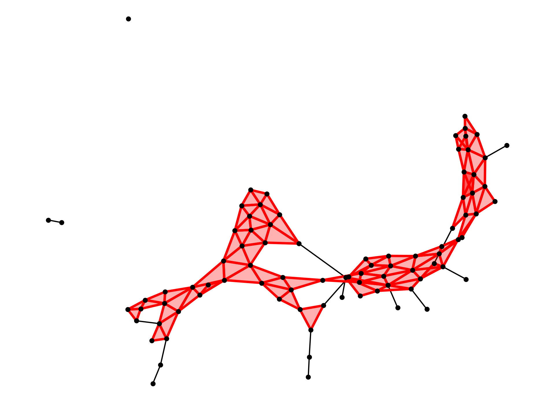
Republican Voting Complex 2020
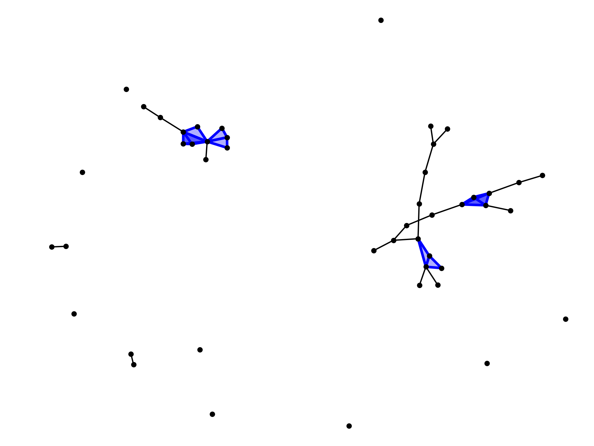
Democrat Voting Complex 2020
If we look at the actual map we can get an idea of what these vertices and simplices actually correspond to. For example, on the republican side, the lonesome pair of vertices on the left is Southampton and Isle of Wight, while the lone vertex in the top left is Accomack County. We can go ahead and create maps for 2016 and 2012's elections as well:
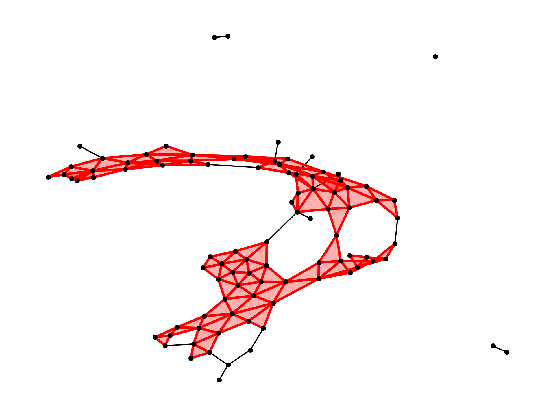
Republican Voting Complex 2016
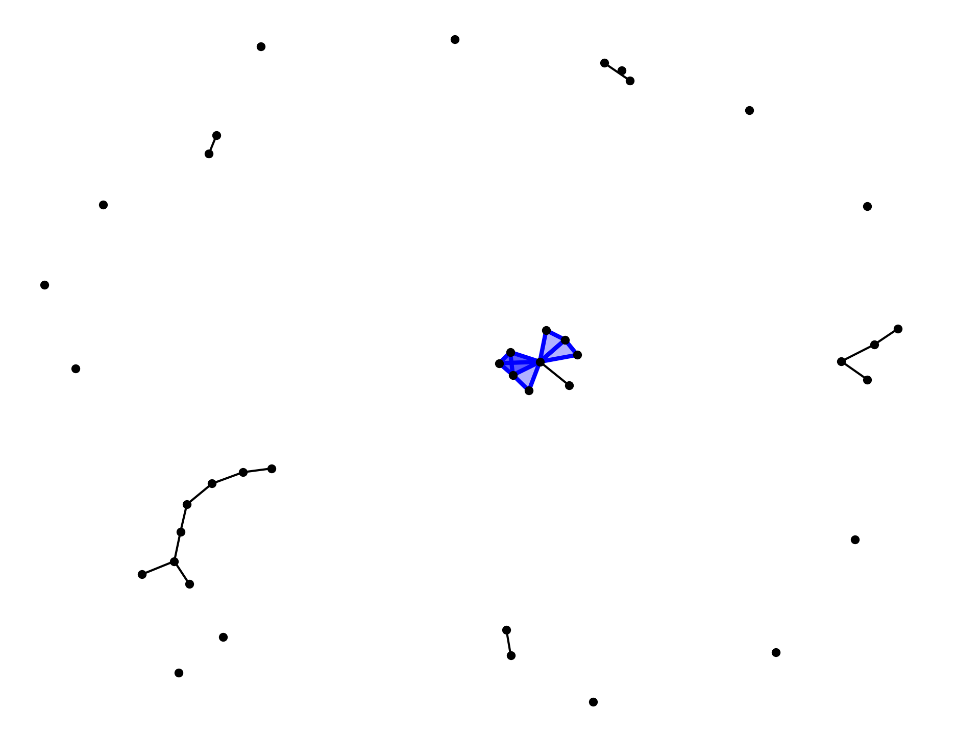
Democrat Voting Complex 2016
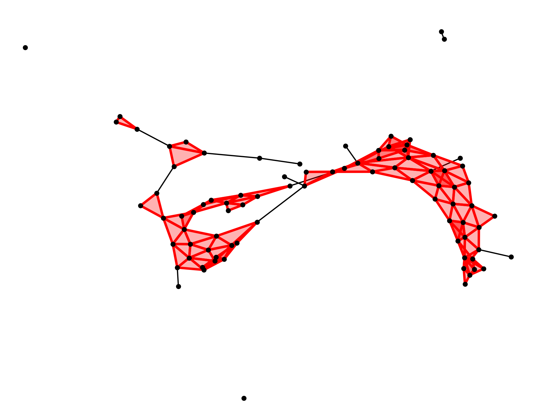
Republican Voting Complex 2012
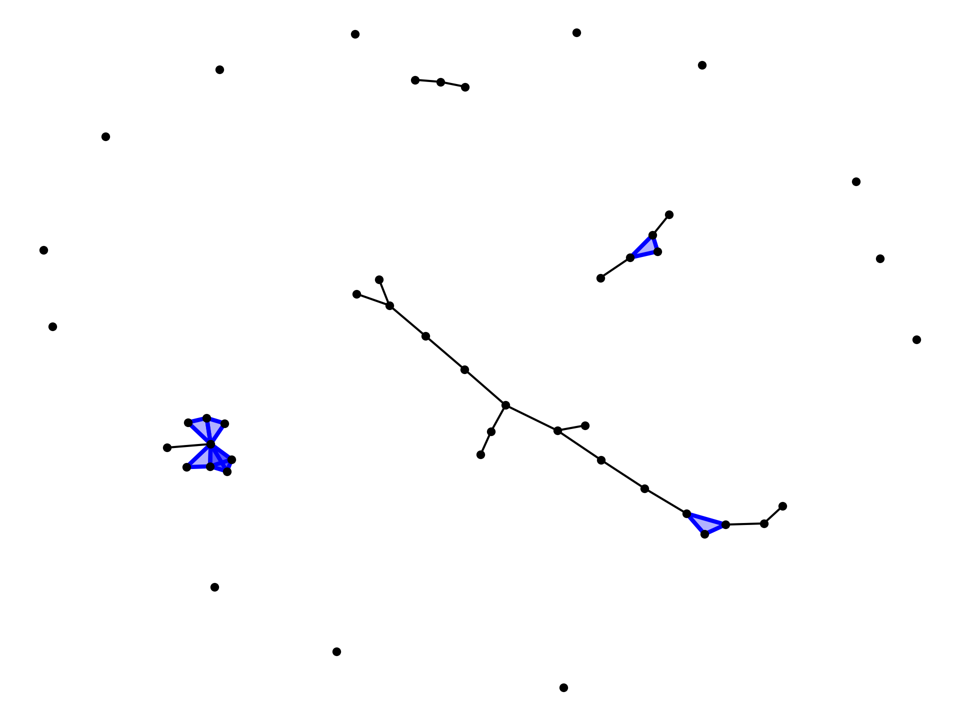
Democrat Voting Complex 2012
These graphs on their own, while maybe pretty to look at depending on who you ask, don’t really tell us much. We can make some very vague observations about the overall shape, such as that the Democrat vote is in small pockets that are often surrounded by Republicans, whereas the Republicans have a much more connected voting body. This isn’t novel, but it certainly is interesting to see it represented this way.
So how can we get useful data? Notice in our graphs how we have all these different components. Some are connected trees, some look like webs of points, and others are standalone vertices. Taking a closer look at these webs, we can see that sometimes they have holes in them. So if our question is how are these shapes changing election to election, a good place to start is there. How are the components of our graph changing?
Introducing Betti Numbers. In topology, these are used to describe the number of n-dimensional holes in an object. If given as a list, the first element would be the number of connected components, the second element would be the number of 1-dimensional holes, the third the number of 2-dimensional holes, and so on. Because we're looking at flat graphs, we only really care about those first two numbers.
Let's flesh this out a little bit more, and add in all presidential elections from the past 30 years. In our data, we get the following Betti Numbers:
| Republican | Democrat | |||
|---|---|---|---|---|
| Year | b0 | b1 | b0 | b1 |
| 2020 | 3 | 4 | 13 | 0 |
| 2016 | 4 | 5 | 19 | 0 |
| 2012 | 4 | 1 | 17 | 0 |
| 2008 | 4 | 2 | 19 | 0 |
| 2004 | 3 | 3 | 16 | 0 |
| 2000 | 4 | 3 | 15 | 0 |
| 1996 | 4 | 1 | 19 | 0 |
Now, with some actual data behind it, we can start to make some observations. The number of connected components for Republicans has stayed fairly constant the last few election cycles, but the number of holes jumped up considerably in 2016 and stayed higher in 2020. From this we can guess that there have been an increase in counties leaning Democratic in the middle of Republican strongholds throughout the state. On the Democrat side, we can see that the number of connected components dropped considerably between 2016 and 2020. Without the voting data it might be easy to misconstrue this as less people voting Democratically, however we know that this is not the case. Instead, it would appear that perhaps Democratic regions of the state may be growing into larger and larger pockets that are brushing up against each other.
What Else Can We Do With This?
I believe that this approach could lead to a lot of interesting results and insights, and that this article is only just beginning to scratch the surface. With much larger datasets, one could backdate all of Virginia's election data to analyze the much broader trends over the state's history. It might be fruitful to include midterm election results as well. On a larger scale, it would be possible to use this approach to view the country as a whole, to see how its voting has changed and how it might continue to change. After all, our country is a union of states, and seeing how these patterns play out on the big stage would be very interesting.
This is just one approach to this process, too. There are many different ways to approach creating the simplicial complexes, such as using geographic data, perhaps using population size to determine epsilon balls around counties for forming a Vietoris-Rips complex. I hope to explore these ideas more in future articles.
As always, all code and sources used for this project are available. I encourage you to play around with this yourself and see what you might find.
Links to all sources and datasets:
[1] A wonderfully done explanation of Vietoris-Rips complexes.
[2] Virginia Polling data for 2020 by Politico.
a href="https://www.youtube.com/playlist?list=PL8erL0pXF3JaR4no7ivppQ5zwhq2QnzzQ">[3] A YouTube Playlist by Professors Robert Ghrist and Vidit Nanda teaching the foundations of TDA, which partially inspired this article.
[4] Virginia Historical Election Data for 2016.
[5] Virginia Historical Election Data for 2012.
[6] Virginia Historical Election Data for 2008.
[7] Virginia Historical Election Data for 2004.
[8] Virginia Historical Election Data for 2000.
[9] Virginia Historical Election Data for 1996.
[10] Wikipedia article explaining Betti Numbers.
Check out the GitHub for this project to get the code and cleaned up dataset